The usage of color in user interfaces often used to associate items with meaning. This can help minimize complexity of data representation (by avoiding a lot of text everywhere). For instance, the usage of a legend where a certain color can mean something special. The problem with this usage is the color and its meaning are usually of arbitrary correlation. Legends in general can help solve the problem of complexity at the expense of usability. You have to keep track of impossible to remember icons or colors in your head and constantly look back to the legend while scanning data.
Similar problems exist between correlating input controls with the devices output. We are surrounded with devices that have terrible design in regards to input and output associations. The classic example being the kitchen stove burners. The knobs are generally layed out in a horizontal row while the burners are in a grid. Making an intuitive correlation impossible between knob and burner. To aid this there is an icon next to each knob, however, there is still the problem in that the user needs to translate the vertically positioned icon into the top down space of the burners for the icon to have meaning. Essentially, all this results in everybody constantly choosing the wrong knob for the burner they want. I still get it wrong everyday and I am cognizant of the situation!

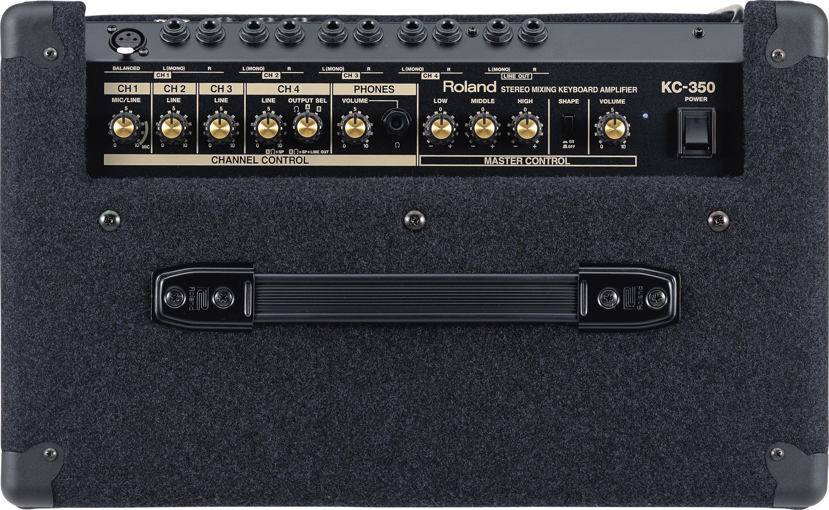
I was equally annoyed after purchasing a Roland KC-350 keyboard amplifier. Like all the other crap I've purchased based on bullet point feature lists, I found it had some serious usability problems. Particularly, the four channel stereo mixer was difficult to use do to its lack of input knob to input jack correlation. Generally this is fairly intuitive with mixers as each channel strip is arranged so its input jack is directly in line with the channel controls. In the case of this amp, the knobs were obscured and offset based on odd numbers of knobs verses jacks. The first three jacks are associated with the CH1 knob, the next two jacks are CH2, etc... They attempted to associate knobs with jack grouping by using numbers... I consider this a serious design failure on rolands part. My bass player gets it wrong every time and needs assistance after plugging in his bass and trying to figure out why the volume knob does not do anything for the channel he's plugged into.
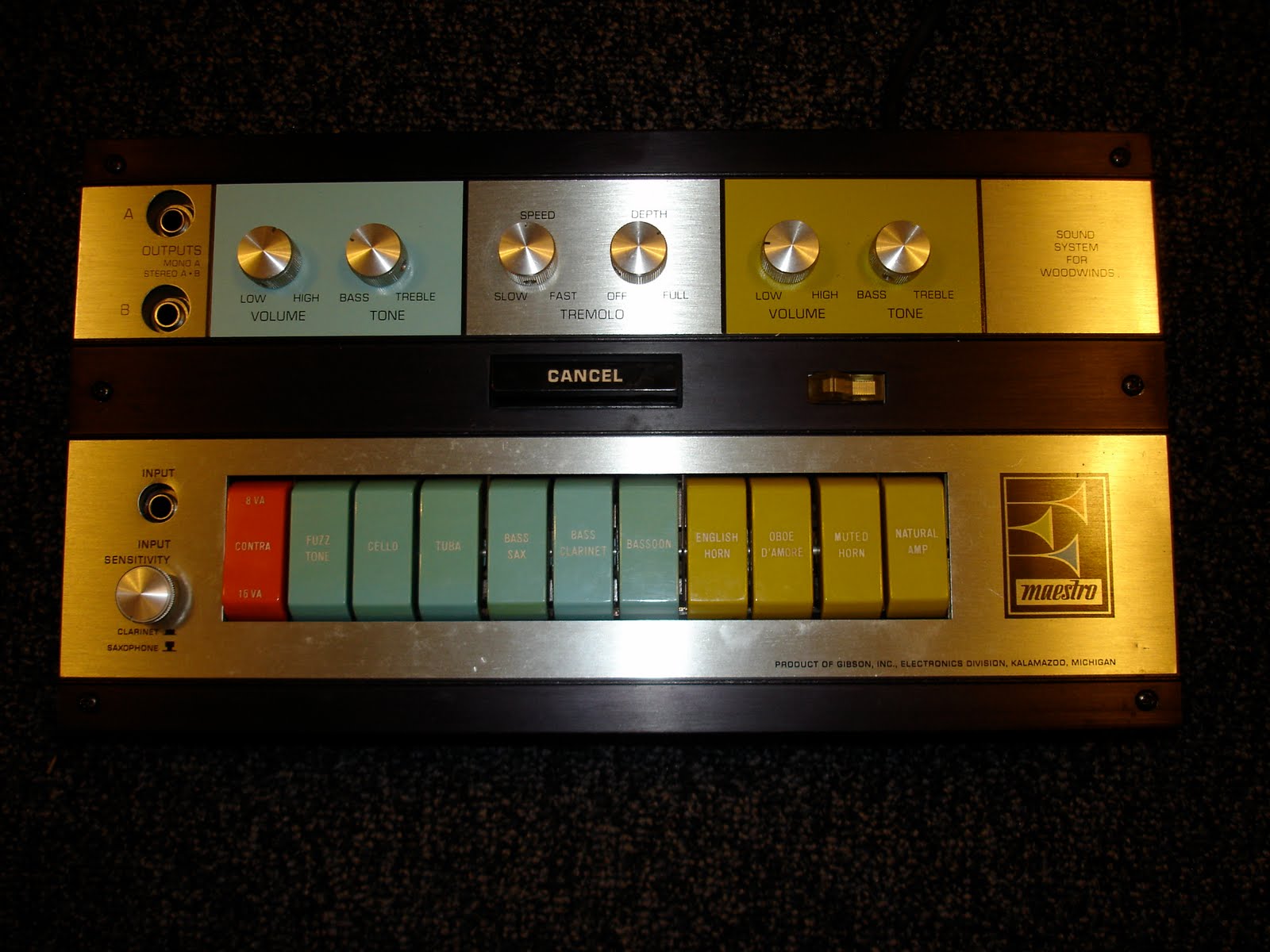
A buddy of mine was showing me this funky piece of gear: Maestro Woodwind Sound System I was pleasantly surprised when I saw audio electronics which used color very successfully to correlate groupings of buttons to a grouping of knobs. It is immediately obvious and and intuitive which volume knobs affect which sound group buttons. No need to read a manual here. And it gave me an idea that a similar technique could be used to correlate lots of seemingly disconnected UI elements in general. While this example might not be considered the most tasteful (personally I love the 60's and 70's look), the usage of color is not visually distracting which is the case with a lot of UIs that utilize color. I believe color can be used tastefully in certain cases to denote association and make things very intuitive.